Mario Bros. Valentine Cards
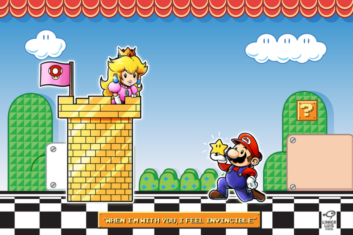 |
| "My Super Star" |
I chose to use the setting from Super Mario Bros 3 in this picture, because of the aesthetics of the whole illustration. I think my idea fits perfectly with the stage play theme.
Originally I was planning to go for the Super Mario Bros 3 exact appearance for the BG, but I decided to soften some black elements on it. In my opinion, it was becoming visually distracting.

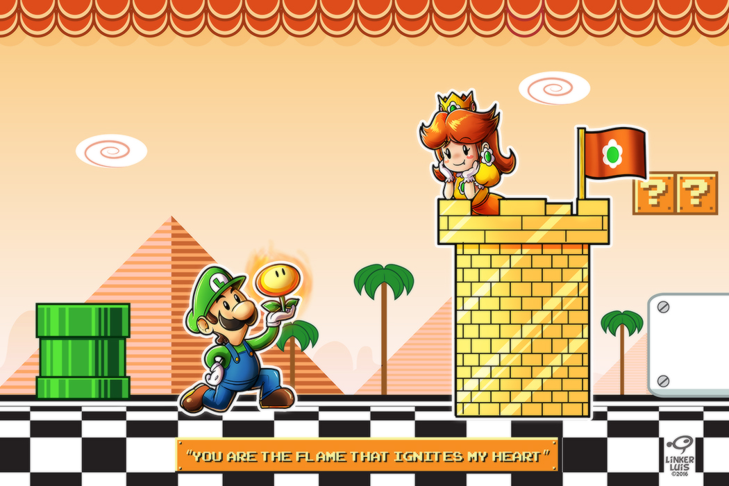 |
| "My Fire Flower" |
For the background, I made a combination of elements. For instance, I was trying to evoke the vibe of the first stage of Super Mario Land, as a reference to Daisy's origins back in the Game Boy era.
However, since that game didn't have any colors, I decided to use the aesthetics of world 2 of Super Mario Brothers 3 instead, simply because I feel that both settings share similar characteristics.
I would say that this one is my favorite of both versions. Maybe I just love the orange color palette that I used for it. I also feel that it gives the picture a warm atmosphere. It just blends perfectly with the concept.
I hope you like all this cuteness, see you in the next artwork!
Comments
Post a Comment